Illustration
Discover professional illustration techniques for vector artists and designers. Find tutorials on composition, character design, icons, flat illustrations, isometric artwork, textures, and building a consistent illustration style.

Your Creator Brand Needs a System, Not a Single Logo
One logo can't survive a YouTube thumbnail, an Instagram post, and a podcast cover — they're three genuinely different shapes. Here's how to build a small, adaptable visual system instead.


Real Estate Marketing Doesn’t Need Photorealism. It Needs Isometric.
Most real estate teams don't know there's a third option between a plan nobody can read and a render that costs a fortune. Here's why isometric illustration is built to win the readability question — no vanishing points, no distorted proportions, just a layout anyone can understand in seconds. It's the format serious teams reach for on site plans, master-plan overviews, and investor decks. It's the wrong tool the moment you're selling one specific unit's finish and mood — that's still a job for photorealism. Here's where each one actually earns its place.
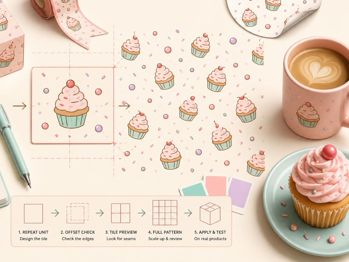
How a Single Cupcake Illustration Becomes an Endless Seamless Pattern
Two designers can start with the exact same cupcake illustration — same colors, same linework, same charm — and end up with completely different results the moment they try to turn it into a seamless pattern for packaging. One version tiles cleanly across a box, a ribbon, a sheet of stickers, disappearing into one continuous, […]
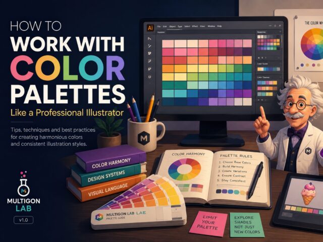
How to Work with Color Palettes Like a Professional Illustrator
Why Color Palettes Matter Every successful illustration starts with thoughtful color choices. While many beginners focus on shapes and details, experienced designers know that a carefully built color palette often determines whether an illustration feels professional or amateur. Working with predefined palettes helps maintain visual consistency, speeds up production, and makes entire collections feel cohesive. […]